Equal Entry
Two platforms redesigned so people could understand what Equal Entry does — and find what they came for.
Executive Summary: Equal Entry's website and Knowledge Base had great content but an outdated look: visitors could be overwhelmed by the content, and the knowledge resources were a new offering. I worked with the team to redesign both from scratch — restructuring how content was organized, rebuilding navigation, embedding accessibility into every structural decision, and building a foundation both platforms could grow on without breaking.
Results
On-the-ground wins
- Simplified service messaging so prospective clients could understand the offering quickly
- Improved content discoverability through redesigned information architecture
- Increased engagement and self-service access to knowledge resources
- Embedded accessibility into navigation, UI patterns, and content structure throughout
- Aligned visual and communication systems across both platforms
The bigger picture
- Transformed organically grown platforms into a cohesive, scalable knowledge ecosystem
- Established design and brand systems to support ongoing growth
- Created a foundation that enables future expansion without structural fragmentation
The challenge: When a platform grows organically, it usually grows in the direction of whoever adds content next. Equal Entry's website was in that position — useful, but hard to navigate, and hard to understand quickly. The Knowledge Base was new and needed to be easy to find, understand and search effectively. Nothing had structural governance. The goal: redesign both in three months, with a foundation that could actually hold.
My Role: Service & Experience Design, Accessibility Consultant, Visual Design
The Team: Founder, Developer, Accessibility Consultants, & Business Development
My Approach:
- 1. Clarified service and content architecture
- Ran workshops and stakeholder interviews to define user goals and business priorities
- Identified key journeys and high-value use cases
- Established structured information architecture for clarity and scalability
- 2. Designed accessible experience foundations
- Redesigned navigation and UI patterns to improve usability and discoverability
- Embedded accessibility best practices directly into structural design decisions — not retrofitted after
- Developed low-fidelity prototypes for rapid validation and iteration
- 3. Built scalable visual and brand systems
- Created consistent communication and visual assets across both platforms
- Partnered with development to ensure sustainable implementation
- Delivered a structured foundation for future growth and content expansion
View all projects Close
- Square Enix: Varioius Projects Work covered: Accessibility, UX, Visual, Web, and QA
- Square Enix: Accessibility Hub Work covered: Accessibility, UX, AI, Visual, Web, and QA
- Equal Entry: Website and Knowledge Base Redesigns
- Medi Me: Medical Records App , Work covered: Accessibility, UX, Visual, and Web
- Weight Watchers: Responsive Signup , Work covered: Accessibility, and UX
- Weight Watchers: Marketing Website , Work covered: Web
- Shoogies NYC: Homemade Baby Food E-Commerce , Work covered: UX, Visual, and Web
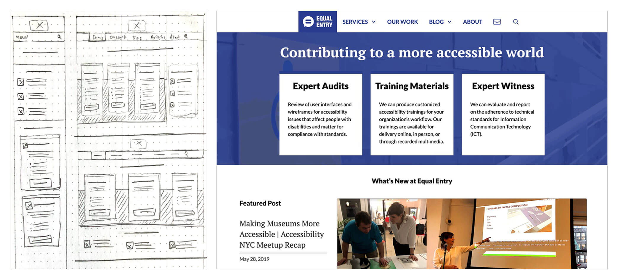
Image Caption: Equal Entry homepage — pencil sketch wireframe alongside the live website version.
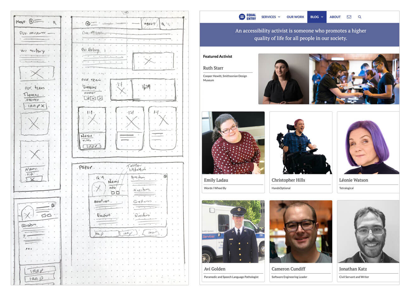
Image Caption: Equal Entry blog — pencil sketch wireframe alongside the live blog version.
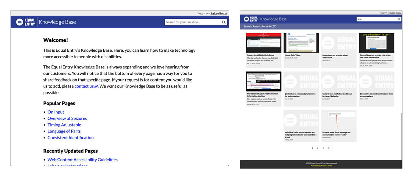
Image Caption: Equal Entry Knowledge Base homepage and search results page.
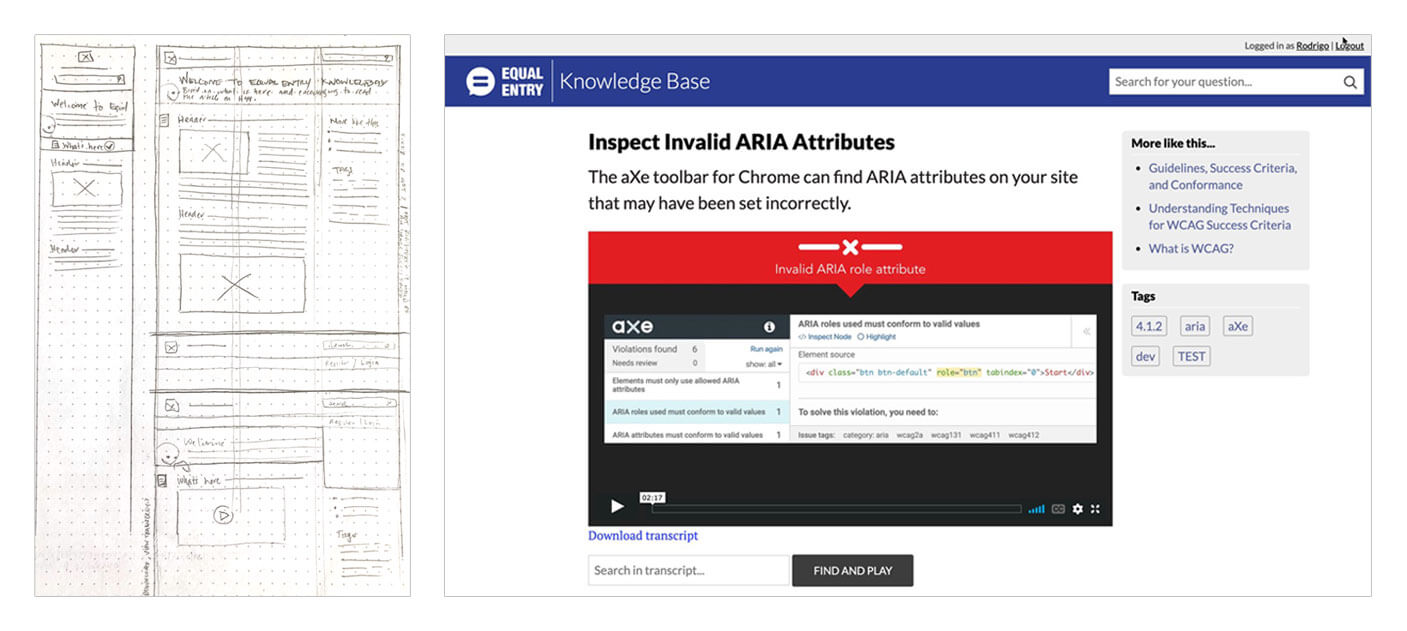
Image Caption: Equal Entry Knowledge Base article post — pencil sketch wireframe alongside the live version.
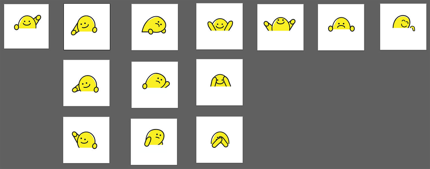
Image Caption: Equal Entry Knowledge Base KnoMo character variations.
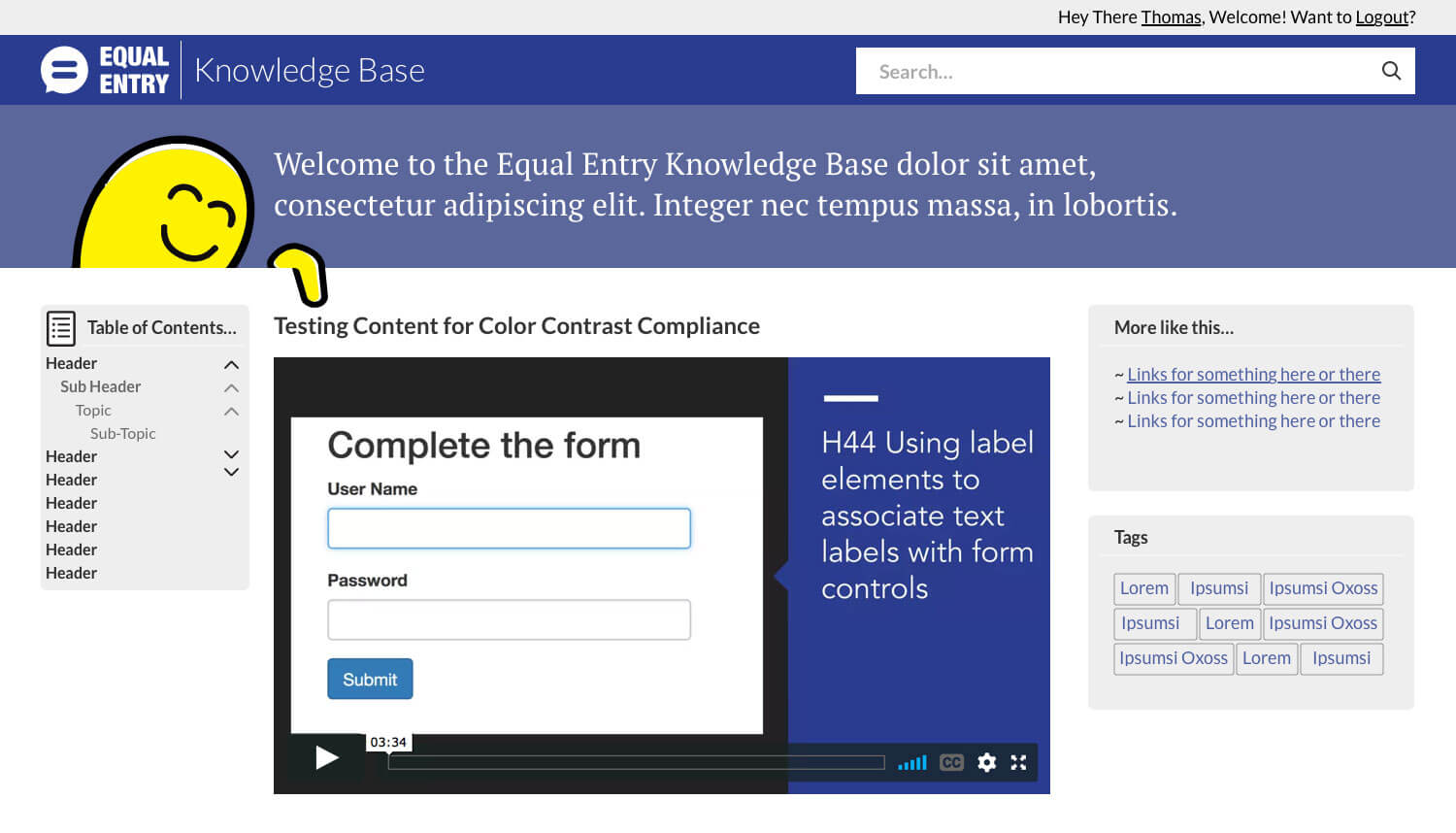
Image Caption: Equal Entry Knowledge Base high-fidelity homepage layout with KnoMo incorporated.