Weight Watchers
A non-responsive, inaccessible signup experience. Six weeks to fix it. Three regions. We shipped.
Executive Summary: The Weight Watchers signup flow didn't work well on mobile, wasn't WCAG-compliant, and didn't match the updated brand. We had six weeks to redesign it, with distributed teams across three regions, in the middle of a transition from waterfall to agile. I led UX and service design — and from the start, I treated this as two things at once: a conversion project and a chance to embed accessibility practices that would outlast the deadline. We improved conversion, established a shared accessibility baseline across regions, and got Legal involved early enough to actually matter.
Results
On-the-ground wins
- Improved usability and WCAG alignment within a six-week delivery window
- Increased conversion — the primary business KPI
- Delivered a responsive, brand-aligned onboarding experience
- Introduced structured accessibility testing practices across teams
- Improved cross-regional collaboration through clearer delivery governance
The bigger picture
- Shifted accessibility from remediation to embedded design and development practice
- Established a shared accessibility baseline across three global regions
- Strengthened Legal alignment by embedding compliance earlier in the lifecycle
- Supported the organization’s transition toward more agile, collaborative delivery
- Created a foundation for future onboarding and conversion initiatives
The challenge: The existing flow was non-responsive, not accessible, and off-brand. Six weeks isn't a lot of time to fix that, especially when your team is spread across three regions with different levels of accessibility experience, your organisation is mid-way through a cultural shift to agile, and Legal has requirements that need to be validated before anything ships. The constraint wasn't just the timeline. It was doing this properly — not just fast.
My Role: UX Lead, Service & Experience Design
The Team: Legal, Product, Design, Engineering, QA, & Cross-regional Stakeholders
My Approach:
- 1. Structured cross-regional delivery
- Designed a delivery model combining async reviews with clear decision ownership
- Maintained momentum across multiple time zones and delivery rhythms
- Aligned stakeholders through shared documentation and governance
- 2. Embedded accessibility into core decisions
- Partnered with Legal to validate accessibility standards early — before designs were locked
- Educated internal and external partners on WCAG requirements
- Introduced structured testing and review checkpoints
- 3. Delivered an accessible, conversion-focused experience
- Conducted research and journey mapping to identify friction in the existing flow
- Designed responsive, accessible onboarding flows
- Worked closely with engineering to implement compliant, scalable solutions on time
View all projects Close
- Square Enix: Varioius Projects Work covered: Accessibility, UX, Visual, Web, and QA
- Square Enix: Accessibility Hub Work covered: Accessibility, UX, AI, Visual, Web, and QA
- Equal Entry: Website and Knowledge Base Redesigns , Work covered: Accessibility, UX, Visual, and Web
- Medi Me: Medical Records App , Work covered: Accessibility, UX, Visual, and Web
- Weight Watchers: Responsive Signup
- Weight Watchers: Marketing Website , Work covered: Web
- Shoogies NYC: Homemade Baby Food E-Commerce , Work covered: UX, Visual, and Web
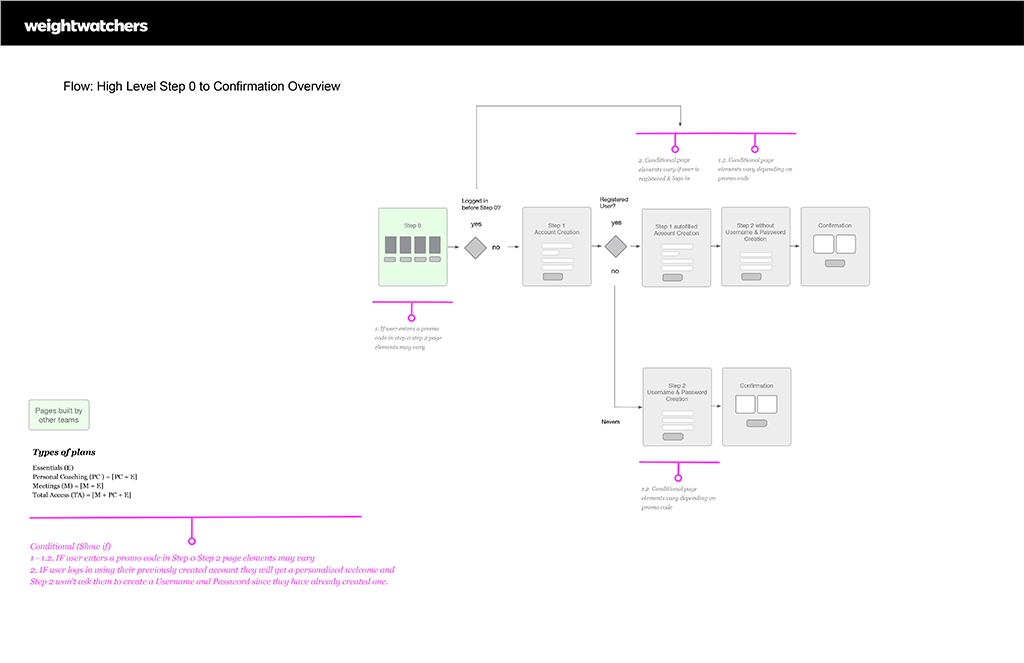
Image Caption: Wireframe documentation — responsive signup high-level overview, Step 0 through to the confirmation screen.
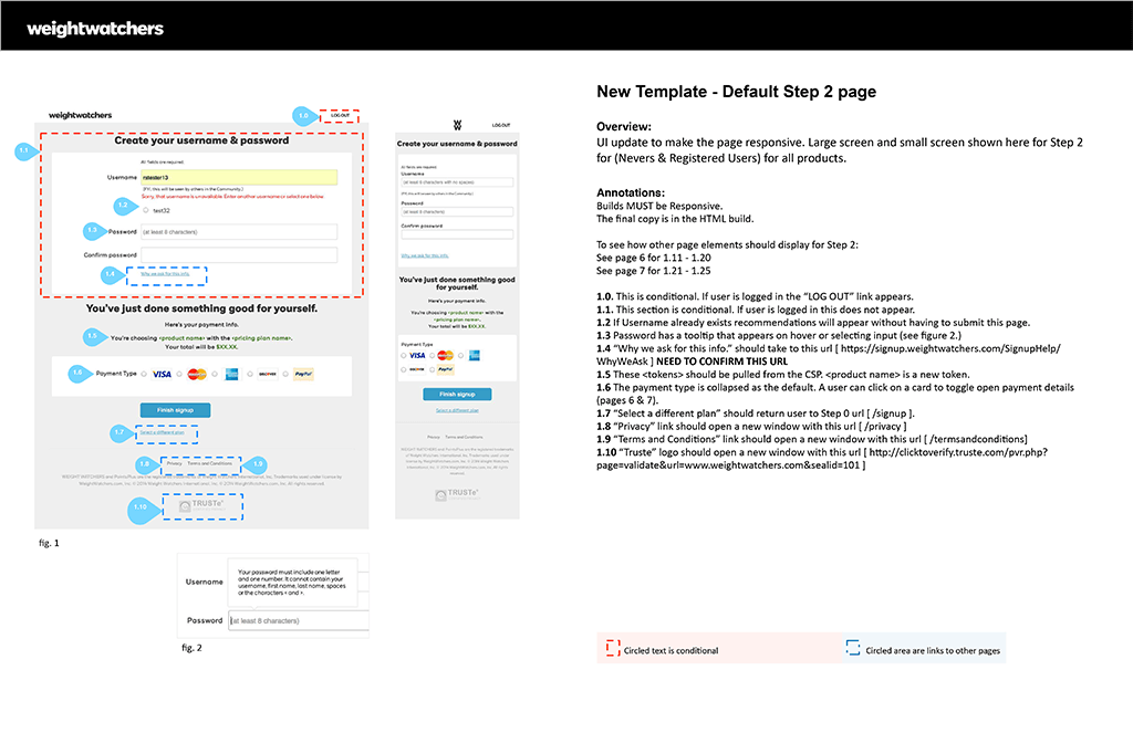
Image Caption: Wireframe documentation — responsive signup default Step 2.
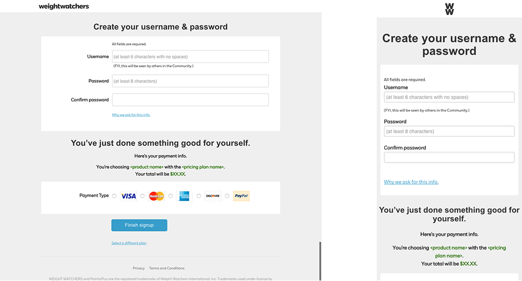
Image Caption: HTML builds for large and small screens — create username and password page.
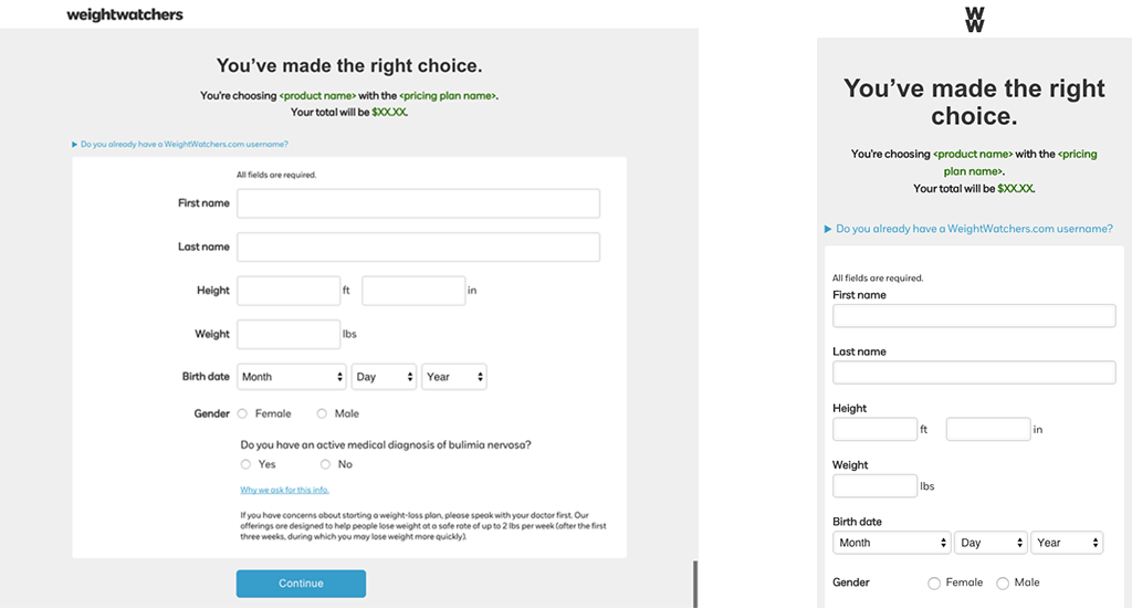
Image Caption: HTML builds for large and small screens — personal information page.